I created the Clear concept for a financial tech design challenge in August 2016. The presentation won second place out of 18 entries.*
Who are most successful investors? The people who forget they have accounts. This and two other principles formed the creation of Clear. Number two: a monkey throwing darts at the Wall Street Journal can pick stocks better than the pros, so don't pick stocks and instead buy index funds. Finally, the paradox of choice shows us that choice overload can be stressful and that constraints in decision making can make people feel secure.
The inspiration to create Clear came from a conversation with a friend who asked for my advice about buying a hot tech stock. He said the price was going up and knew he needed to start saving for retirement, so this seemed like a good place to start. I talked him out of buying the hot tech stock (which has since gone way down) and urged him to invest in a mutual fund designed for a retirement date. I wanted to point him to a product that would focus solely on this goal, but it doesn't exist... so I designed Clear to meet that need.
The ideal product should have:
- A laser like focus on maxing out the maximum monthly contribution in an IRA retirement fund. This is the single biggest determinant of whether your family will be financially secure in retirement.
- Guardrails that keep people from getting of track, like buying a hot tech stock. Any investment that precedes maxing out the contribution rate is less than optimal.
- Provide motivation sacrifice now and max out the contribution rate, to enjoy the rewards later
- Fit all the important financial information onto one page. The calming and beautiful simplicity will have two effects:
- People will know whether or not they are on track. It will be obvious if they need to take action or if they can forget about their account (and become one of the most successful investors who forget they have an account).
- People can be confident referring the service to friends. If you understand this and know that your friend won't feel dumb looking at it, you can feel good about referring it.
Product Design
(reminder: created in one week for a design challenge, so please forgive the rough edges)
Landing page
"The best way to save for retirement is to forget about it"
This may be the most limited and restrictive financial product on the market, and the homepage will explain why this is just what you need. Picking winning stocks or any kind of active involvement yields worse results than consistently investing in a target retirement fund. The following pages assume a user has signed up; this onboarding process is important, but not shown in this design.
Less than Max Contribution
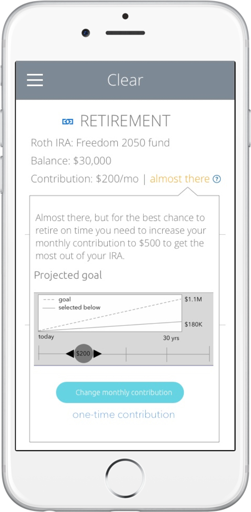
The single page shows how the investment is tax-sheltered (Roth IRA), name of the target date fund (2050 Fund), balance, and contribution rate. Anything less than the max contribution rate of $500/mo will show an "almost there" alert with a large call to action to increase the rate.
The two most important other investments, a brokerage and college savings, are available but locked out until the max contribution rate is reached.
Less than Max Contribution - Motivation
A customer with a less-than-max contribution rate has one other important interactive element - a layover with content outlining the importance of the contribution rate.
Customer with Max Contribution Rate
Customers who are maxing out their IRA contributions may open a brokerage and college savings funds. We encourage the same hands-off approach to a brokerage by showing risk allocation instead of the daily fluctuations in market price, which is largely meaningless. If a customer wants a low-risk portfolio but owns mainly individual stocks in tech companies, their risk mix will skew high, alerting them to the need to find less risky bonds or funds.
Next Steps
Given more time to work on the project, I would focus on the motivation elements and perform extensive usability research to see what works best to help people understand that the monthly contribution rate is the most important number.
*Another designer refined my sketches into the more polished interfaces shown here. A business analyst with experience talking to customers about retirement helped refine the product offerings.


