dano qualls


ux researcher and product designer


I'm a researcher and designer who finds satisfaction in solving hard problems. I'm happiest at work when I can be a part of the entire design process, from discovering the user’s world before you ever brainstorm a solution, all the way to delivering the final product. 

My most recent work is under NDA, so my public portfolio will focus on the types of research and design I have performed, how I worked with other team members to create great designs, and what I learned along the way.


UEGroup (User Experience Group) is a world-class research and design agency in San Jose, CA. I was fortunate to spend a year working with their team as a remote designer in Denver. I worked on several projects but my main project was an aerospace maintenance and logistics software redesign project. All of my work with UEGroup is under NDA, so to get an idea of the quality of work the agency creates, please see examples of their work here.


Aerospace Maintenance and Logistics

Our team redesigned a legacy tool for the maintenance and logistics support of a high-tech, next-generation military aircraft. The project included discovery research, multiple designs, usability testing, and delivering developer-ready final assets.

Building Physical Security Management

I was the lead designer for a redesign of a tool that manages the cameras and lock access for large buildings. The existing system was powerful but unintuitive. The redesign maintains all the existing capabilities but with a simplified and common method of interactions.

Emotions Research and Medical Devices

I contributed to a handful of medical device design projects in small ways and took the lead on designing a new feature for an existing usability research tool that seeks to measure the emotions of participants.

Recreation.gov is an interagency project that highlights how to access public lands across America. Member agencies include the National Park Service, US Forest Service, Bureau of Land Management, and nine other agencies. I worked with two scrum teams on multiple micro-services as a UX designer and product manager.


Internal Accounts

Our team created a small number access levels common across all twelve agencies and developed permissions models for managing site content and the accounts of people working at those sites.

Reports

We consolidated over 100 reports used by the twelve agencies into two dozen reports, and created a way to send the report automatically to users or roles.

Parks Pass

Recreation.gov sells interagency annual passes that grant entry to parks and preserves at multiple agencies, as well as site-specific passes that grant entry for a day, week, or year at one location.

My first full-time UX role after three years of working at my startup and completing a five-month agency internship was at Fidelity Investments. I spent nearly two years as an information architect working with three scrum teams charged with updating service transactions. I worked closely with a product manager to translate requirements into designs that used the Fidelity design language, performed usability testing to garner support for decisions, delivered pixel-perfect specs to developers, and worked with the engineering team to bring the designs to life.


Apply for Margin Trading

Margin trading is a high-risk feature and Fidelity wants to ensure customers match their margin trading abilities to their risk tolerance. I created a mobile-first design that uses the interaction of the page to explain the rules of this complex financial instrument.

Margin and Options Accounts

The margin and options accounts page shows which accounts have these trading features, but the rules about which accounts are eligible is not intuitive. Through multiple designs and testing I found interactions that clearly align accounts to eligibility.

Change of Address

Every account can be assigned to a unique address and people can have seasonal addresses, making something people expect to simple suddenly difficult. This design keeps it simple for average customers while allowing flexibility for complex customers and accounts.

Hipmunk vs. Google Flights

Quantitative study comparing the efficiency of the tools, as well as the impact of brand personality

Why do people join a community?

Behavioral trends research to uncover why people join communities, so PegaSystems can create a better developer community

HBR.org Usability Study

Qualitative usability studies to improve HBR.org, with a focus on mobile

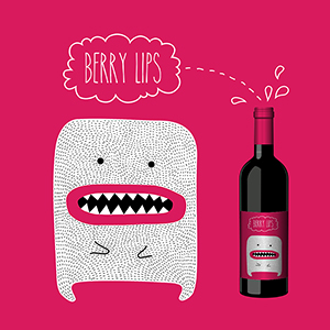
Wine Startups

How might we create new brands or increase sales for existing ones?

I co-founded two companies in the wine sector in 2011-2014, which gave me my start in product design. WineKick was a kiosk to recommend wine, beer, and liquors in grocery and liquor stores. Drink Crate was a crowd-sourced label design and voting platform for white-label wines.

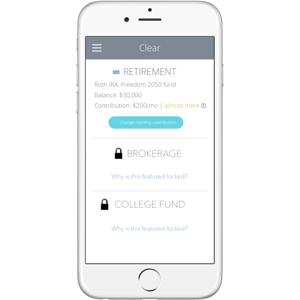
Clear

How might we make it easy for people to save for retirement?

Using simplicity and restricted choice to make the world's easiest and most effective retirement savings product. This was a concept for introducing people to saving for retirement designed for Fidelity Investments.

Earth.io

How might we invest in environmentally friendly projects?

Earth.io was a startup where I worked with a fellow Babson MBA student to create a spare-change investing app that worked with projects such as organic farming and renewable energy for a good return for the investor. This is the best example in my portfolio of my abilities as a visual designer.

AUX Form Challenge

One of the Fresh Tilled Soil Apprentice in UX Design (AUX) challenges was to create a web form using progressively enhanced HTML, CSS, and JS from scratch. See the original design here.

danoqualls.github.io

The site you are viewing now was created in Squarespace. I'm creating one very similar to it using Zurb Foundation and hosting it on github.io. When it's ready I'll redirect danoqualls.com to that site. 

Rails Tutorial

I worked through Michael Hartl's Ruby on Rails tutorial in an attempt to create the Lab Notebook by myself. Building it solo was a bit beyond my current skillset, but we brought in another developer and used my designs. It is hosted internally at Fidelity at this time.


I’ve heard that the difference between a junior and senior designer is that a junior designer can create a brilliant solution for a well-defined problem, and a senior designer can create a brilliant solution for a vague problem. I’ve learned that (and a few other important things) in my eight years of creating digital products and services. Here are some of the key lessons. I hope to turn these into blog posts this year.


UEGroup

Blog posts coming soon:

  • The importance of research of every stage of planning, design, and re-design

  • Redesigning a legacy system (and why you can’t judge or blame the previous designer)

  • Making the complex simple (and why it got complex, in the first place)

  • The devil is in the details, and so is the success of a design


Recreation.gov (Booz Allen Hamilton)

Blog posts coming soon:

  • The key to keeping stakeholders happy — documentation

  • Why being a designer can make you a better product manager

  • Why our satellite dev teams were just as successful as the headquarters teams


Fidelity Investments

Blog posts coming soon:

  • Working with and innovating within design systems

  • The importance of good product managers

  • Making the most of guerilla research

  • Walking decision makers to fruitful conclusions


Fresh Tilled Soil

Blog posts coming soon:

  • Learning to discuss design was the hardest thing about becoming a designer (and how improv comedy has helped)


WineKick / Drink Crate (Startups)

Blog posts coming soon:

  • UX exists to help the company thrive (and why the best product won’t save your company)

  • If I did more discovery research, would I have ever founded my startup?